Our logo
The Simployer logo is based on the Rubik medium typeface with our 3 dots replacing the “i”, as well as a few subtle modifications.
- Always use logo files provided - do no re-create or modify in any way.
- Do not combine logo with co-brands using text - ask for the appropriate logo.
- Please make sure white-space around the logo is correct.
Primary logo - positive
Primary logo - negative
Secondary logo - positive
Secondary logo - negative
Stage 1: the tie-in
In the event of acquisitions, the first step is to display logos/branding with a tagline to establish the tie-in to Simployer.
It is also common to state this in the footer of websites/presentations.

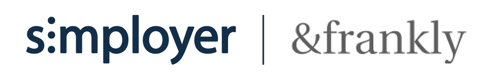
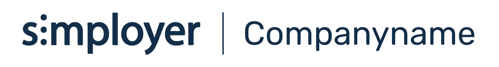
Stage 2: co-branding
If the logos do not match, or if separate branding is ceased but name kept, the company name should be set in Rubik medium as in stage 3. Consult design team.
Stage 3: partnership
The Partnership logo should evolve to a product logo in due course, if applicable.
Module & product logos
These logos are used in our applications only - and not as part of branding. The primary logo and app title are separated by a forward slash.
Consult design team.
Desktop
The desktop version uses the primary logo, a slash and the module/product name
Mobile
The mobile version uses the secondary logo, no slash and module/product name.
Note: the secondary logo size/height should be the same as the primary logo used in other contexts so the transition looks good between public sites - module/product.
Default: the logo should have free space to the size of two stacked “o”s from the logo in all directions.
Tight: if space is limited, such as in a header, minimum white space to the size of a single “o” from the logo.
The same white space rules apply to all logo variations.
Favicons
Secondary logo, but with square canvas. Normally renders in several sizes. Note that these may be used as bookmark icons on handheld devices. This may create a conflict with our native app icons.
The App & Fav-icons should be white on our Primary Dark Blue background for everything Simployer.
Native app icons
Native apps for iOS and Android. Note: original files do not have rounded corners.
App icons for Simployer suite, &frankly, Learning Library
Logo & colors
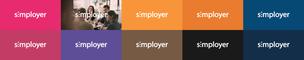
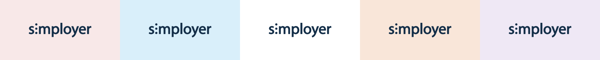
Simployer logos may only be set in primary dark blue or white. Background colors can vary according to figures below. We recommend using the standard colors for all headers - white logo on Primary dark blue background.
Recommendation:
If the visitor is exposed to Simployer content that uses one of the secondary, tertiary or background colors to carry the visuals, try to have the primary logo combo shown in context.
Example: if you have a Powerpoint presentation using pinks, use a start and end slide in Primary dark blue/white.
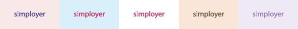
Logo colors: positive and negative
Primary - positive
Primary - negative
Allowed variations
Black or gray positive logos are meant for occasions where colors are not available.
If you need to place our logo on top of an image, please ask the design team for assistance to ensure contrast is within requirements.
Examples: not allowed
Custom logos?
In some cases we want to make one-offs for certain campaigns or events - where the logo and colors do not adhere to the guidelines found here.
Requests for custom variations should always go through the UX team, and never be used without approval.
